Beyond The Rainbow: Your Ultimate Guide to Pride Flags
Every June is Pride Month – a time for those in the LGBTQ+ community to come together and celebrate the progress that has been made, as well as reflect on the tumultuous history and suffering they have experienced. Read on to learn about the history of the Pride Flag, and what different groups have as their representation.
A Brief History of Pride Flags
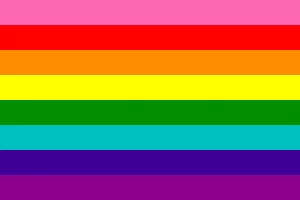
Gilbert Baker, born in 1951 & raised in Parsons, KS, had served in the US Army between 1970 & 1972. After an honorable discharge, Baker taught himself how to sew. In 1974, Baker met Harvey Milk, an influential gay leader, who later challenged Baker to devise a symbol of pride for the gay community. The original gay pride flags flew at the San Francisco Gay Freedom Day Parade celebration on June 25, 1978. Prior to that event, the pink triangle had been used as a symbol for the LGBT community, despite representing a dark chapter in the history of homosexuality. The pink triangle had historically been used to identify & stigmatize men interned as homosexuals in World War II. Rather than relying on a tool of oppression, the community sought a new, inspiring, symbol.
A close friend of Baker’s, independent filmmaker Arthur J Bressan Jr., pressured him to create a new symbol at “the dawn of a new gay consciousness & freedom”. According to a profile published in the Bay Area Reporter in 1955, Baker “chose the rainbow motif because of its associations with the hippie movement of the Sixties, but he notes that the use of the design dates all the way back to Ancient Egypt”.
While there has been speculation that Baker was inspired by the Judy Garland song “Over the Rainbow”, when asked, Baker said that it was “more about the Rolling Stones and their song ‘She’s a Rainbow'”. Baker was likely influenced by the “Flag of the Races” (with five horizontal stripes: red, white, brown, yellow, and black), popular among the World Peace and Hippie movement of the 1960s.
The first rainbow flags commissioned by the fledgling Pride committee were produced by a team that included artist Lynn Segerblom. Segerblom was then known as Faerie Argyle Rainbow; according to her, she created the original dyeing process for the flags. Thirty volunteers hand-dyed and stitched the first two flags for the parade.

The Flags, Explained:
The original Pride Flag, designed by Gilbert Baker, was flown in 1978.
Hot Pink – sex
Red – life
Orange – healing
Yellow – sunlight
Green – nature
Turquoise – magic & art
Indigo – serenity
Violet – the spirit of LGBTQ people
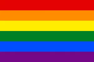
After Harvey Milk was assassinated in 1978, demand for the Pride Flag grew exponentially. Hot pink was excluded from this design as it was difficult to source, and turquoise was removed, so the flag design could split down the middle (3 colors per side of the street). This design is still one of the most widely used in the world.
Red – life
Orange – healing
Yellow – sunlight
Green – nature
Blue – serenity
Violet – the spirit of LGBTQ people
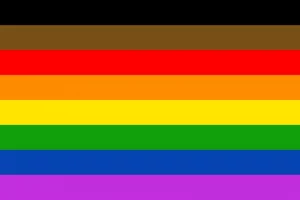
The Philadelphia Pride Flag was the first nod towards intersectionality, as black & brown colors were added to draw attention to POC within the LGBTQ community.
Black – diversity
Brown – inclusivity
Red – love & light
Orange – healing
Yellow – sunlight
Green – nature
Blue – serenity
Violet – spirituality
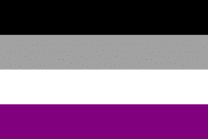
The asexual flag was first made in 2010, and was inspired by the Asexual Visibility and Education Network (AVEN) logo.
Black – asexuality
gray – gray-asexuality
White – non-asexual (allosexual) partners
Purple – community
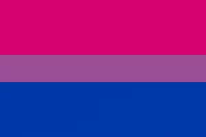
The bisexual flag was first designed in 1998 by Michael Page.
Pink – attraction to those of the same gender
Purple – attraction to two genders
Blue – attraction to those who identify as a different gender
The pansexual flag was first created in 2010, and is meant to be distinct from the bisexual flag.
Pink – attraction to those who identify as female
Yellow – attraction to those who identify as genderqueer, nonbinary, agender, androgynous, or anyone who doesn’t identify on the male-female binary
Blue – attraction to those who identify as male
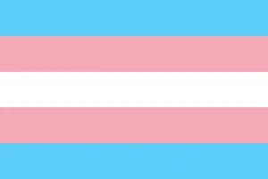
The transgender flag was created by Monica Helms, a transgender activist and former member of the U.S. Navy, in 1999. This flag was made to break the ideals of the gender binary.
Light Pink – identify as female
White – identify as intersex, transitioning, or see themselves as having a neutral or undefined gender
Light Blue – identify as male
The nonbinary flag was created by Kyle Rowen in 2014, and was made for those whose identity doesn’t fall within the male-female gender binary.
Yellow – those who identify outside of the gender binary
White – those who identify as multiple genders
Purple – those whose identity incorporates aspects of male and female
Black – those who do not identify as any specific gender
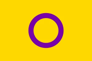
The nonbinary flag was created in 2013 by Morgan Carpenter, who ran Intersex International Australia. The colors purple & yellow were picked specifically due to their lack of reference within the gender binary. The circle is unbroken and unornamented, symbolizing wholeness, completeness, and potentialities.
The gay man flag was designed around the same time as the lesbian flag. These colors were changed from their original blue tone, which was regarded as a stereotypical representation of the gender binary.
Green – community
Light green – healing
Teal – joy
White – gender-nonconforming, nonbinary, & trans men
Light blue – pure love
Purple – fortitude
Violet – diversity
The lesbian flag is a recent addition, being made in 2018 by Emily Gwen. The colors of pink and orange were chosen to represent the full range of lesbian identities.
Dark orange – gender nonconformity
Orange – independence
Light orange – community
White – unique connection to womanhood
Pink – serenity & peace
Dusty pink – love & sex
Dark rose – femininity
The new flag was designed by Daniel Quasar in 2018, who sought to integrate the historic and modern-day struggles of the LGBT movements with racism. This flag, seen flying year-round at our Adrift Hospitality properties, combines the familiar color groupings of LGBTQ pride, transgender pride, and POC pride. The placement of the new colors in an arrow shape is meant to convey the progress still needed.
Red – life
Orange – healing
Yellow – sunlight
Green – nature
Blue – serenity
Purple – spirit
Black & Brown – recognition of the Black community & representation of those who are affected by the AIDS/HIV crisis
Pink, White, & Light Blue – affirmation of the trans community